How to Make Truly Terrible Graphs: A Tutorial
David L. Streiner, special guest contributor and co-author of excellent statistics texts
Part 2: Pie in the Sky
To really screw up visual presentations, use a pie chart. Even better, use two or more of them.
In my last blog, we learned the first step in making truly terrible graphs, by confusing the role of a visual with that of a table. But that barely scratches the surface of how graphing packages can allow us to totally screw up. This blog will examine another widely misused technique: pie charts.
Pie charts are the essence of simplicity. If you have a nominal variable with a number of response options, such as “What is the dullest subject you ever studied in college?”, the size of each slice is proportional to the number of people endorsing each alternative, as in the figure below:
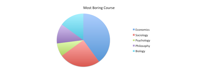
It’s obvious that Economics ranks highest on the list and Psychology at the bottom. (The fact that I’m a psychologist did not influence these fictitious data in the slightest.) That was easy. So what’s there not to like about this; isn’t it as American as, say, apple pie? Well, actually no. To begin with, it’s origins are Scottish, not American, with William Playfair’s 1801 book, The Statistical Breviary. Even if we ignore Spence and Wainer’s (2001) description of him as an “engineer, political economist and scoundrel,” Playfair has much to answer for. The first problem is the cognitive load imposed on the viewers. They have to first find a color on the chart, move over to the legend to see what course it corresponds to, then move on to the next color, and so on. Not too much of a problem when there are only two or three segments, but the task gets more and more difficult as the number of response options increases. Also, with a greater number of segments, the colors are often progressively harder to discriminate from one another. Again, these problems are exacerbated if the chart is thrown up on a screen for only a brief period of time.
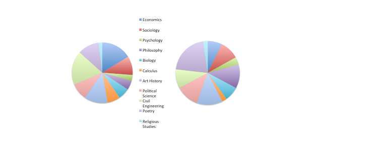
“That’s easy enough to fix up,” I hear you say, “we’ll just put the labels next to each slice. Problem solved!” Well, not really. That may work if we have a small number of slices, but what will happen when there are a larger number of responses? We can see what happens in the next figure.

Getting pretty messy, isn’t it? Some of the legends are inside the pie and some are outside. But this is the least of our problems.
Which slice is larger, Biology or Philosophy? It’s not that easy to tell. The problem is that we’re not very good at judging angles. We tend to underestimate acute angles and overestimate obtuse ones. Moreover, the amount of distortion is different, depending on whether the slice is oriented vertically or horizontally (Robbins, 2005). OK, we can solve that – just include the numbers along with the course names.

Did that help? Not really. Now the chart is even more crowded and we’ve violated the lesson from the first blog – don’t try to turn a figure into a table. A far better way to display these data would be a bar chart:

This shows the relationships among the courses much more clearly, with little mental effort required by the viewer. Note two other things. First, to make the graph even easier to read, the courses have been put in rank order. Second, because the legends are relatively long, the graph has been turned on its side. The course titles never could have fit along the X-axis without a tremendous amount of clutter; or they would have had to have been written vertically. By putting the graph on its side, the viewers don’t have to lie on their sides to read them.
This reinforces one motto of statisticians: “The only time a pie chart is appropriate is at a bakers’ convention.”
To echo the cry of TV sales people, “But wait … There’s more!” We can screw up even more royally. Quoting the master maven of graphing, Edward Tufte (2001), “the only thing worse than one pie chart is lots of them.” Let’s say we broke down the data by gender, with a pie chart for females on the left and males on the right:
It’s easy enough to see that females find economics more boring than do males, because both slices start at 12:00 o’clock. But what about art history or sociology? In order to compare men and women, you have to look at a slice, mentally move it over to the other pie, rotate it until the starting edges line up, try to keep the angle constant, and see if the trailing edges line up. This is not difficult – it’s nearly impossible. Yet again, bar charts would greatly clarify the picture. (By the way, the proportions finding art history and sociology boring are exactly the same.)
So lesson two – to really screw up visual presentations, use a pie chart. Even better, use two or more of them.
References
Robbins, N. (2005). Creating More Effective Graphs. New York: Wiley.
Spence, I., & Wainer, H. (2001). William Playfair. In: C. C. Heyde & E. Seneta (Eds.). Statisticians of the Centuries, pp. 105–110. New York: Springer.
Tufte, E. (2001). Visual Display of Quantitative Information (2nd ed.). Cheshire, CT.: Graphics Press.

Discussion
No comments yet.