How to Make Truly Terrible Graphs: A Tutorial
David L. Streiner, special guest contributor and co-author of excellent statistics texts
Part 1 – Introduction
In 1968, when I was writing up my doctoral thesis, I needed to make some graphs showing how the different groups changed over time under various conditions. There were no computer programs to draw graphs (indeed, there were no such things as desk-top computers back then), so I had to draw the lines by hand, using special pens and ink, and the symbols and letters were added by rubbing them off special sheets of transfer paper. It took an entire day or more to make a single graph, and few people had the ability to do them (I had the advantage of training in engineering, and having spent five summers working as a draftsman). Consequently, there were relatively few graphs in journals, and those which did appear were simple black and white line charts or bar graphs. Researchers had very little ability to screw things up.
Nowadays, every computer comes equipped with at least one, and often two, graphing packages, and they allow the user to add a host of special effects – being able to make the graphs look three-dimensional, to have pie charts with segments highlighted by separating them from the rest of the pie, or to use bars of different shapes and colors. Even more options are available if the graphs will be used during a live presentation: you can use many different fonts and colors; text can fly in and out from any direction; and you can add logos from your university, your research unit, and the funding agency at the bottom of every slide. This is in addition to pictures of leaves or keys or some other totally irrelevant (but cutesy) graphic running down the left side. In other words, users are able to screw up graphs in ways that were previously unimaginable.
Unfortunately, few people know how to take full advantage of these features in order to draw truly terrible graphs. Over the next few months, I hope to remedy this parlous situation in this blog and teach you how you, too, can make graphs as bad as those that grace the pages of many daily newspapers and popular magazines. As an added bonus, I will also show you how to make tables that are unnecessarily dense, obscure, and confusing.
The first lesson in bad graphing, and the focus of this blog, is to fail to differentiate between the purpose of a graph and that of a table. Take a look at the graph below. It shows the expenditure per acute hospital bed in seven regions of a province in Canada. Now imagine you’re sitting in a darkened auditorium and this is on the screen for 30 seconds. So look at it for a while and then close your eyes. Now tell me: What was the average for the entire province? What was the expenditure in region C? Which region had the highest expenditure? (Actually, if you can read these questions, you’re cheating, because your eyes must have been open to do so.)
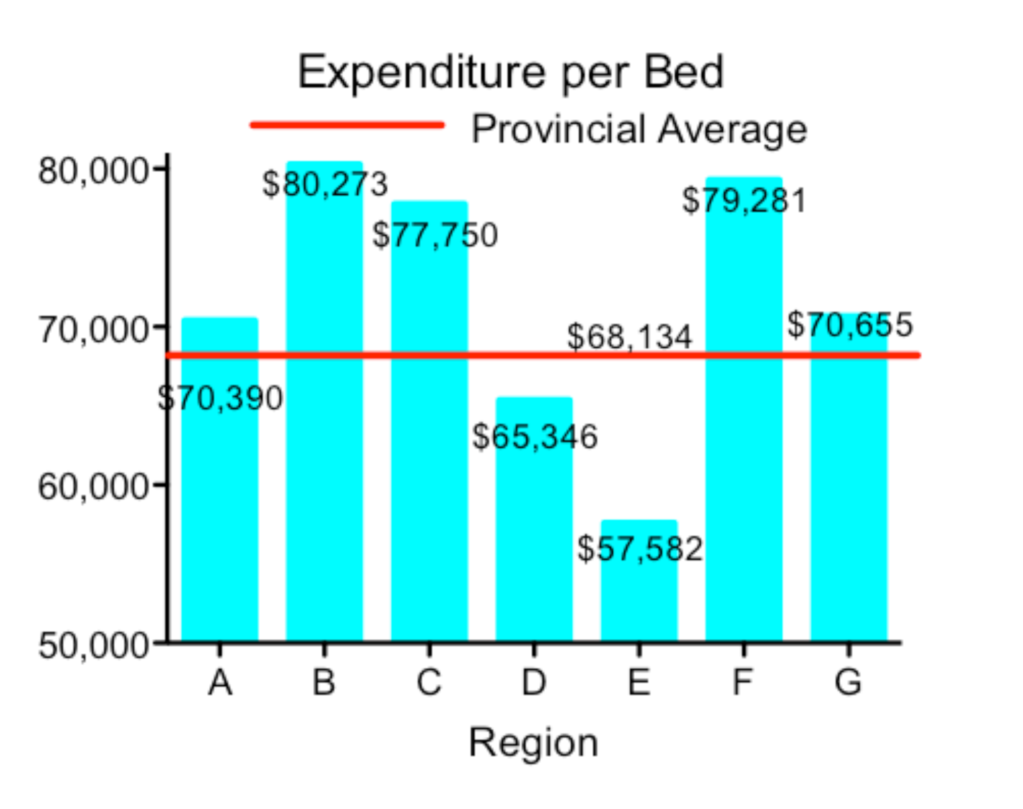
I’m willing to bet that if you didn’t peek, you’d have trouble answering the first two questions, but may be able to answer the third. It’s simply impossible to remember all those numbers, except perhaps that they’re somewhere in the range of $60,000 to $80,000, and a lot easier to pick up the fact that Region B is the highest. This illustrates the major difference between a table and a graph – the former is better for presenting numbers and the latter for showing relationships. You may be able to get away with a graph such as this one on the printed page, where the reader has the luxury of staring at it as long as he or she wants, but it would be a disaster if it were shown during a talk. There’s just too much information for the viewer to absorb in just 30 seconds or so. If you want the audience to come away with the message that there are large differences among the regions (and that’s all they will remember one hour later), then kill the numbers.
In fact (and jumping ahead a bit), we can make the message even stronger. Because Region is a nominal variable, the order doesn’t matter, so let’s make the audience’s task easier by rank ordering the regions, and we get a graph like this one:
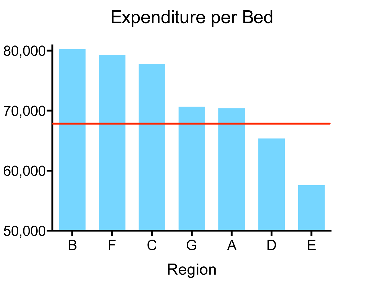
Now the message comes through loud and clear – there are large differences among the regions, where B is the clear winner and E gets shafted. So the take-home messages are: (1) be clear what you want to communicate, (2) use tables to show numbers, (3) graphs should be used to show relationships, and (4) do everything possible to make it easy for the audience.

Discussion
No comments yet.