How much in taxes??

2012 doesn’t seem so important
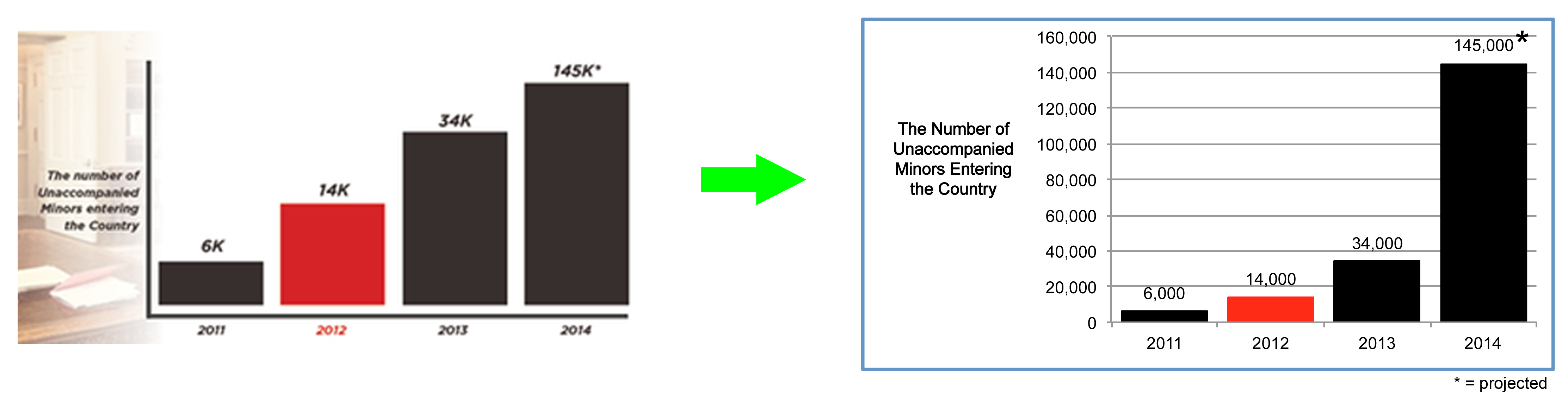
The silliest thing about this chart is that by drawing it incorrectly, the author is missing the opportunity to show the true magnitude of the changes. Isn’t that the point? Well, maybe, maybe not; the point is remarkably well hidden. The red bar at 2012 seems to be trying to convince us that something important happened in 2012. I don’t see it on the original chart, frankly, and if the bars are scaled properly 2012 is even less interesting. Would it surprise you to learn this graph was made by a politician to “demonstrate” that in 2012 there was a surge in immigration?
Thanks to Dr. David Streiner for bringing this chart to my attention
Birth of the Blog