How to Make Truly Terrible Graphs: A Tutorial by David Streiner
Part 4: Where’s the Y?
In previous blogs, I described how to make terrible graphs using some of the features of leading graphing packages, such as pie charts and 3-D graphs. But, this is unfair to users of other programs that do not offer these “enhancements” (yes, such programs do exist; in fact, I use them exclusively except when I’m preparing talks for hospital and university administrators). “How,” I hear them cry, “can we too make truly terrible graphs?” Well, do not despair; help is at hand. In this blog, I will discuss a very easy way to turn a straightforward graph into a disaster.
The vast majority of graphs have two axes – the X-axis (abscissa) along the bottom and the Y-axis (ordinate) running along the left side. There can be variants of this, such as having a secondary Y-axis on the right, or having the Y-axis cross the X-axis in the middle, but these won’t change the basic message. Also in most cases, the Y-axis starts at zero and runs up (or down, in some cases) to the maximum. Simple as this seems, it leaves a lot of room for mischief. The best way to thoroughly distort what the data show is to have a “floating Y” – starting the axis at some point other than the natural base, which in most cases is zero. For example, let’s assume that the university’s president is trying to justify his request for an (obscenely high) increase to his (already obscenely high) salary because his workload has gotten so much heavier over the past few years. To bolster his case, he presents the following graph to the board of governors:

Wow! Look at the increase. Of course we have to reward him (although we could ask why he’s still working a shorter week than mere mortals). But wait a second – the Y-axis doesn’t start at zero; it’s floating up there with a minimum of 30. What would the graph look like if it did start at zero?
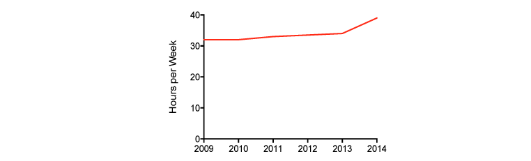
That’s more like it and just as we suspected; that “increase” is barely perceptible without a microscope. By shrinking the range of the Y-axis, small differences are magnified.
You may object to this graph on esthetic grounds, that most of the graph – the area below 30 – is blank, and why waste space showing nothing? That’s a valid point. There are times when it doesn’t make sense to start at zero. In these instances, the honest thing to do is at least alert the reader to that fact by making a break on the axis, like this:

Note that we’ve made a bit of a compromise; there’s less empty real estate, but the increase appears a bit more extreme than it actually is. We’ll discuss in a bit how to determine if there’s too much of a distortion.
Lest you think that exaggerating differences by having a floating Y-axis is restricted to unscrupulous administrators (if that isn’t a redundancy), here’s a graph taken from an article purportedly showing that the risk of suicide is reduced by attending religious services (Kleiman & Liu, 2014).
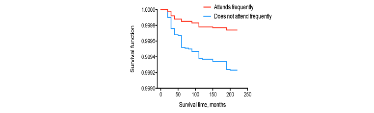
For those of you who are unfamiliar with survival analysis, the left axis, “Survival function,” shows the odds of being alive after a given time for the two groups.
Again, the first reaction is Wow! Maybe we should all think of attending services a couple of times a week, if not every day, and that’ll really reduce our risk. But let’s take a closer look at the Y-axis. The bottom is not at zero, but at 0.9990. In other words, the entire range is 0.001 rather than 1.0. That “difference” between the groups is actually 0.9998 versus 0.9992 over an 18 year span. I tried plotting it with a true zero, and the lines were perfectly flat and superimposed on one another, as was the case with starting it at 0.80 and 0.90. In fact, I couldn’t see any light between them until I did:

Even here note that the axis extends only from 0.98 to 1.00. Kinda sorta makes you want to reconsider how you spend your weekends, at least insofar as preventing suicides is concerned.
So, how can you tell if a graph is misrepresenting what’s really going on? You can use the Graph Distortion Index (GDI) proposed by Beattie and Jones (1992). It’s defined as:
GDI = (% change depicted in graph ÷ % change in data) – 1
In the first graph, the president’s change in time looks like a 350% increase (from 20% up the Y-axis to 90% up the axis), whereas the actual increase is 15.6%. So, plugging those numbers into the equation we get (350/15.6) – 1 = 21.4, which is more than a bit higher than the recommended maximum of 0.05.
Remember what we said in an earlier blog: the main purpose of a graph is not to present numbers, but to allow the viewer to get an immediate visual impression of what’s going on. So don’t despair; even if you can’t make pie charts or 3-D graphs, you can still really distort the data by using a floating Y-axis.
References
Beattie, V., & Jones, M. (1992). The use and abuse of graphs in annual reports: Theoretical framework and empirical study. Accounting and Business Research, 22, 291–303.
Kleiman, E. M., & Liu, R. T. (2014). Prospective prediction of suicide in a nationally representative sample: Religious service attendance as a protective factor. British Journal of Psychiatry, 204, 262-266.
Discussion
No comments yet.