How to Make Truly Terrible Graphs: A Tutorial
David L. Streiner, special guest contributor and co-author of excellent statistics texts
Part 3 – 3D or not 3D
In the two last blogs, we learned the first steps in making truly terrible graphs: by confusing the role of a visual with that of a table, and by using pie charts. But that barely scratches the surface of how graphing packages can allow us to totally screw up. This blog will examine another widely used travesty: making the graph look three-dimensional. Indeed, in some (unnamed, at least for now) programs, the default option is 3-D, and you have to work hard to reset it to make the bar chart or pie chart 2-D. With so many newspapers using 3-D graphs in their pages, you may be excused for thinking that this is good practice; after all, they are ever so much sexier and eye-grabbing than the flat, 2-D types. So what if they are harder to read and distort the data; isn’t that a small price to pay for sexy and cutesy? Yes if you’re an administrator, but No if you’re a scientist.
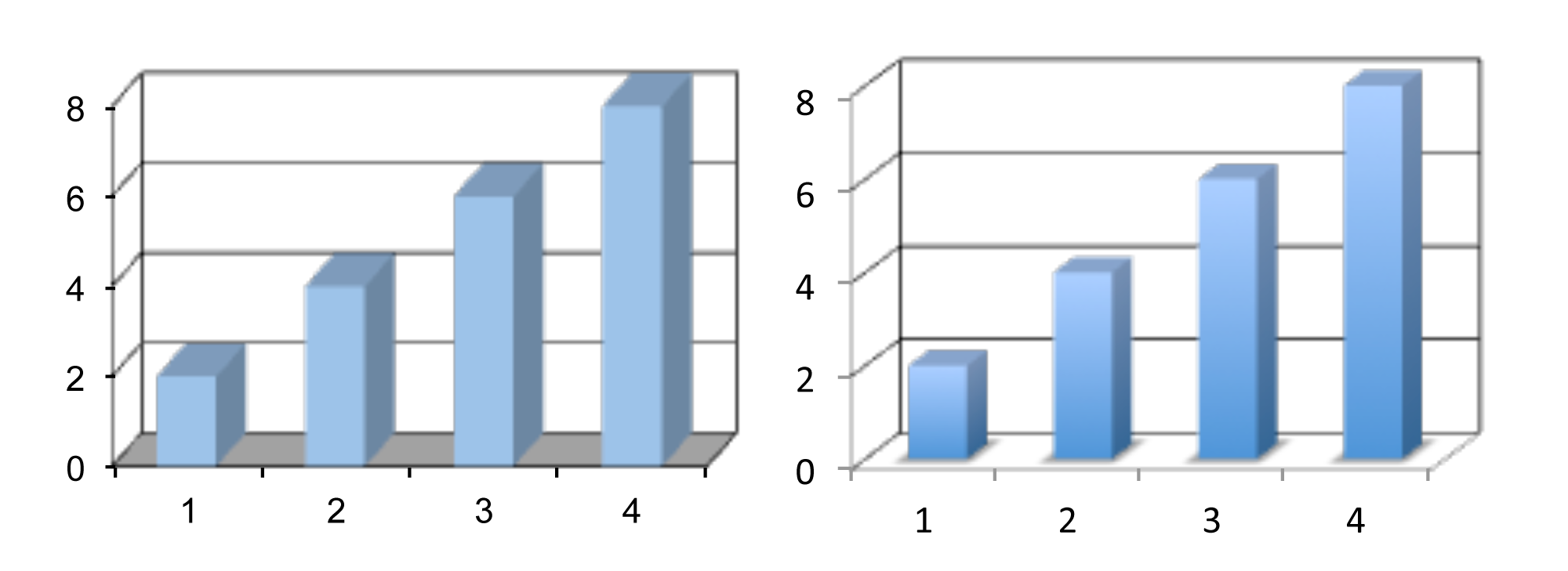
Take a look at the first graph; can you guess what values are being plotted?

Not that easy, is it? First, do you attend to the front of the bar or the back? The front grabs our attention, but it’s actually the back that’s important. Then you have to follow the lines on the back “wall” over to the left, turn down by about 20 degrees, and read the number off the Y axis. Not too hard here, but imagine that the bar fell in between the labeled values; even more estimation and guesswork is required. Now, what are four values? You’d be excused f you said 2, 4, 6 and 8, but “Gotcha!” The values are actually 2.22, 4.22, 6.22, and 8.22. The reason that the bars look smaller than their true values is seen at the floor of the graph. The bars aren’t flat against the back wall; they’re displaced somewhat in front of it. So, to get the true values, you first have to mentally project the level of the top upwards to the back wall by the same amount that the bar is displaced, and then carry that line to the left and back down; a totally unnecessary series of steps, prone to error at each step.
Let’s add insult to injury by plotting the same set of numbers (2, 4, 6, and 8) using two programs created by the same, still unnamed, software company. The one on the left was made with PowerPoint (whatever happened to spaces between words?) and the one on the right by Excel – same data, different look (oops, did that give away the name of the company?). I pity the poor people sitting in the audience trying to figure out the real values.
Compare that to a simple 2-D chart:
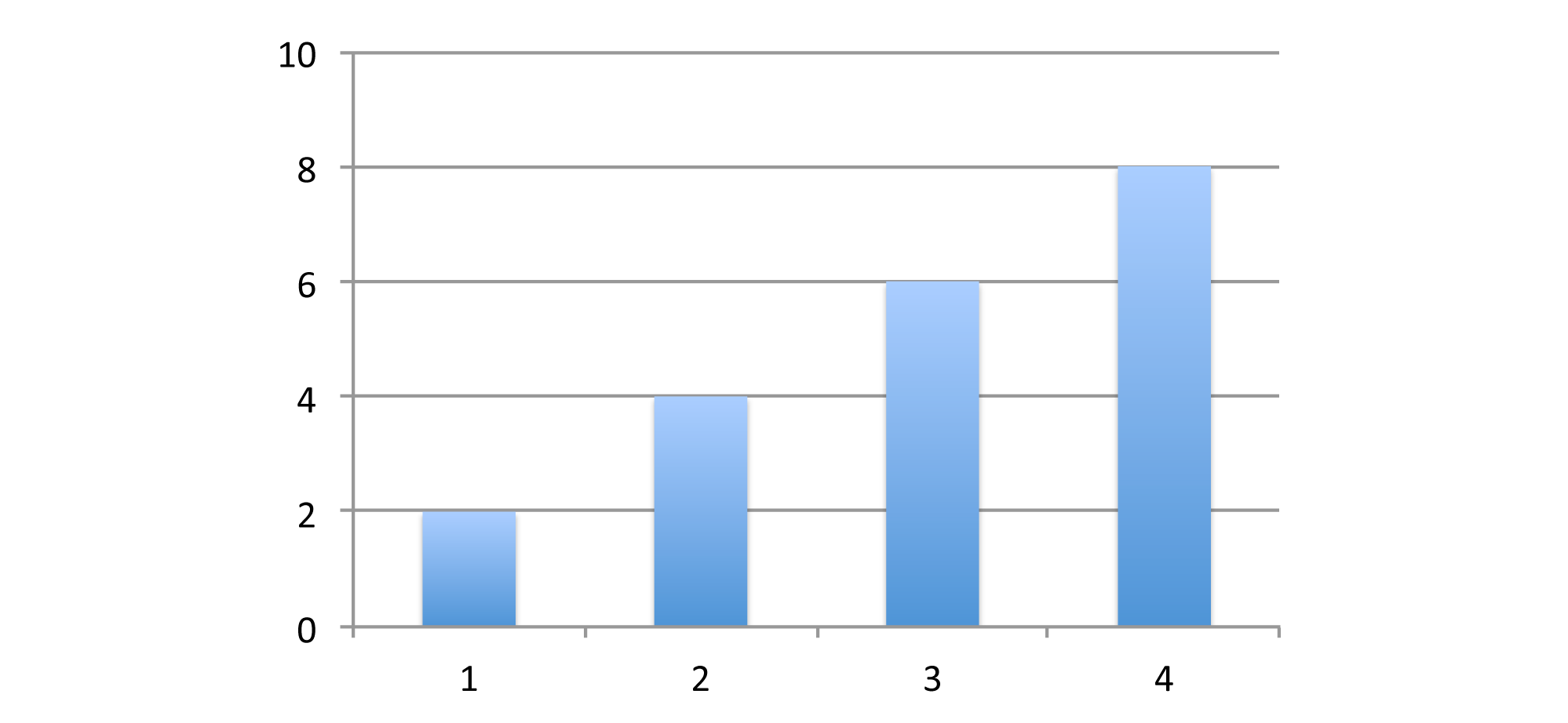
Not nearly as sexy. The only things it has going for it are that (1) it’s easy to read; (2) there’s no ambiguity; and (3) it’s accurate. Obviously, university and hospital administrators will shun 2-D graphs in favor of 3-D.
As the final step, let’s combine the worst of both worlds – 3-D pie charts.
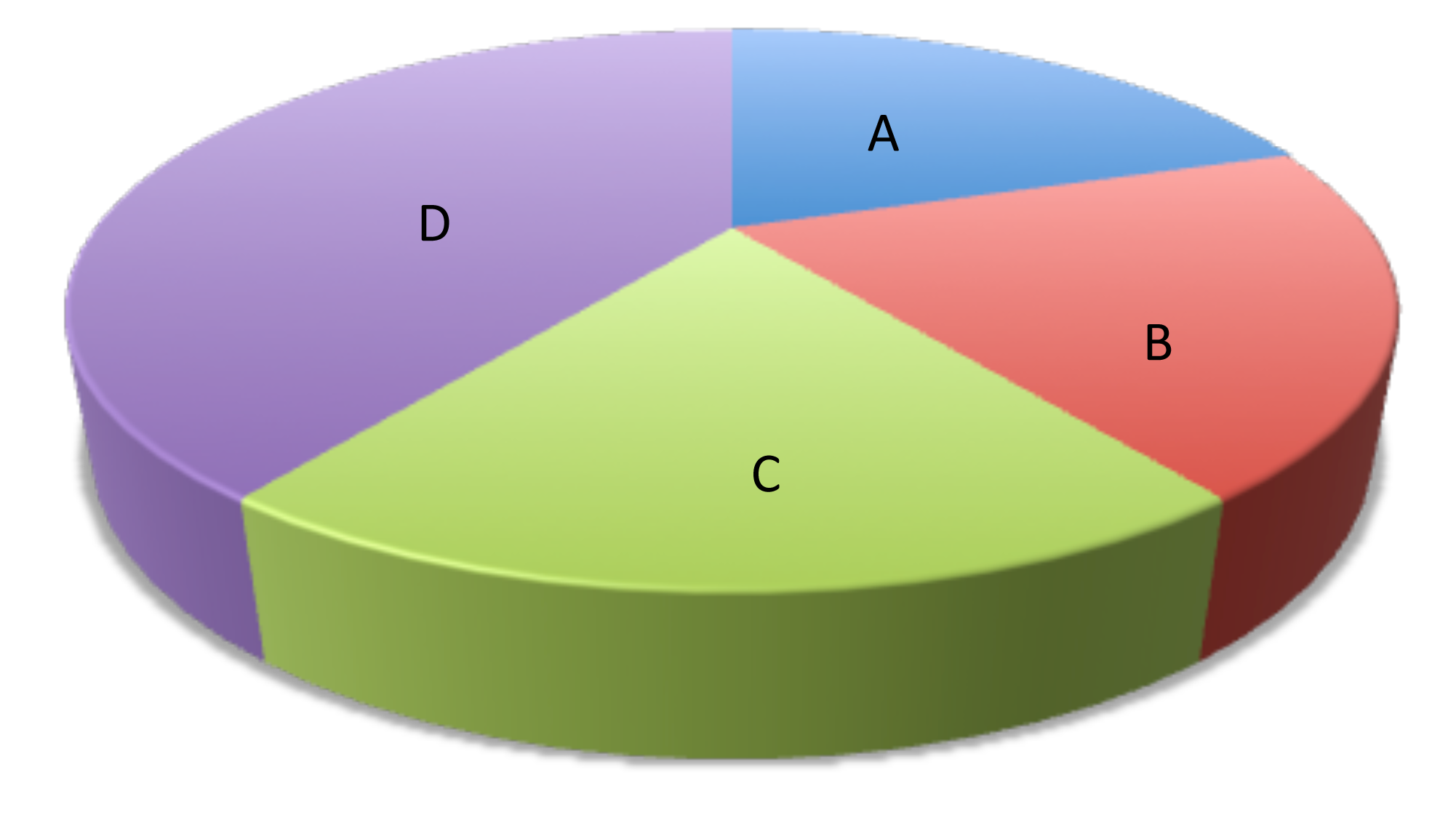
Rank order the four segments. Most likely, you’d say A < B < C < D. That would be understandable, but it’s the second “Gotcha!” In fact, A, B, and C are the same, and D is twice as large as each of them. So why did you get it so wrong? I mentioned in the previous blog that equal angles are perceived differently, depending on whether they are oriented vertically or horizontally, and that’s part of the problem here. The other part is that tilting the pie distorts the angles even more. You can try this at home – make a 3-D pie chart with four equal segments, and then modify the angle of the tilt and see what happens. With any luck, that will be the last 3-D pie chart (or any type of 3-D chart) you will ever make.
So in conclusion, if you really want to screw up a chart (or if you’re making a presentation to administrators), use 3-D graphs, and especially 3-D pie charts. Meanwhile, real researchers will be content with only two dimensions.

Discussion
No comments yet.